Renewal of a monthly report generation system, based on data from Salesforce

Introduction
Project Name: Millions
Brief Description
Renewal of a monthly report generation system, based on data from Salesforce.
Project Phases: Research, UX Design, UI Design
Background
“Millions” is the largest fundraising company for nonprofits in Israel. They had been using an old, complex system, custom-built, to generate monthly reports. The original system was intended to simplify the process but ended up making it cumbersome, unclear, and frustrating for users
Redesign
Research
UX/UI Design
B2B
Prototype
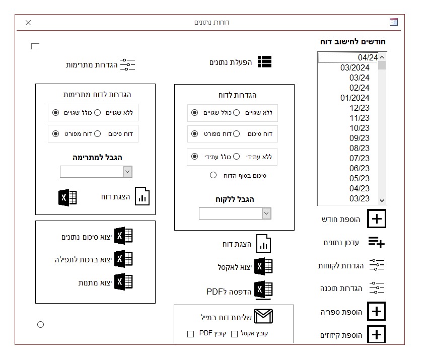
The old system
The Problem
At the end of each month, the management team needed to produce critical financial reports. The current system was not up to the task: it was heavy, slow, non-intuitive, and compromised the efficiency and accuracy of the processes.
The Goal
To build a new system that is fast, intuitive, and secure — allowing users to focus on what matters: proper management, not wasting time on technical issues.
Main KPIs of the Project
- 70% reduction in time spent generating monthly reports.
- Increase in the number of independent users (non-CEO) from 1 to 6.
- Elimination of human error in updating monthly charges through a clear update process, visual controls, and confirmation steps — down to near zero errors
Research
- In-depth Interviews:
Interviews were conducted with the two main users: the company CEO and the office manager. The CEO elaborated on organizational needs; the office manager expressed deep frustration with day-to-day operations, saying, “You don’t want to be near me when I log into the system…” - Observation:
I observed the actual update and report generation process, identifying bugs, bottlenecks, and usability traps that caused uncertainty and wasted time. - Screen Recording Analysis:
I broke down the process step-by-step to identify what caused cognitive overload and created a detailed documentation.
View the document
Key Insights
- The system structure lacked hierarchy and clear segmentation.
- No user permissions — all data was accessible to everyone, including sensitive information.
- No clear save process — data updated automatically.
- No feedback (toast/pop-ups) on user actions.
- Visual design lacked distinction between static and editable elements.
- A black screen appeared during loading, causing stress.
- No ability to set default settings.
At this point, the research phase was complete, and I validated the insights. It was time to redesign the experience.
I asked myself:
What user behavior do I want to encourage?
This was the starting point for rethinking the system. I aimed to understand how to transform it into a tool that guides the user confidently forward — a helpful interface rather than a confusing one.
Persona
Age: 38
Role
Head Office Manager — responsible for monthly and management reports.
Background
Experienced, deeply familiar with the system, but frustrated with its operation.
Quotes
“I want the system to work for me — not the other way around.”
Goals
- Accurate and efficient report generation.
- Fast data updates with minimal error risk.
- Reduce dependency on senior staff.
Frustrations
- Non-intuitive interface.
- Lack of structure and hierarchy.
- Frequent human errors.
Digital Needs
- Clear segmentation by function.
- Reports customizable by range and filters.
- Role-based security and user permissions.
- Immediate feedback for every action.
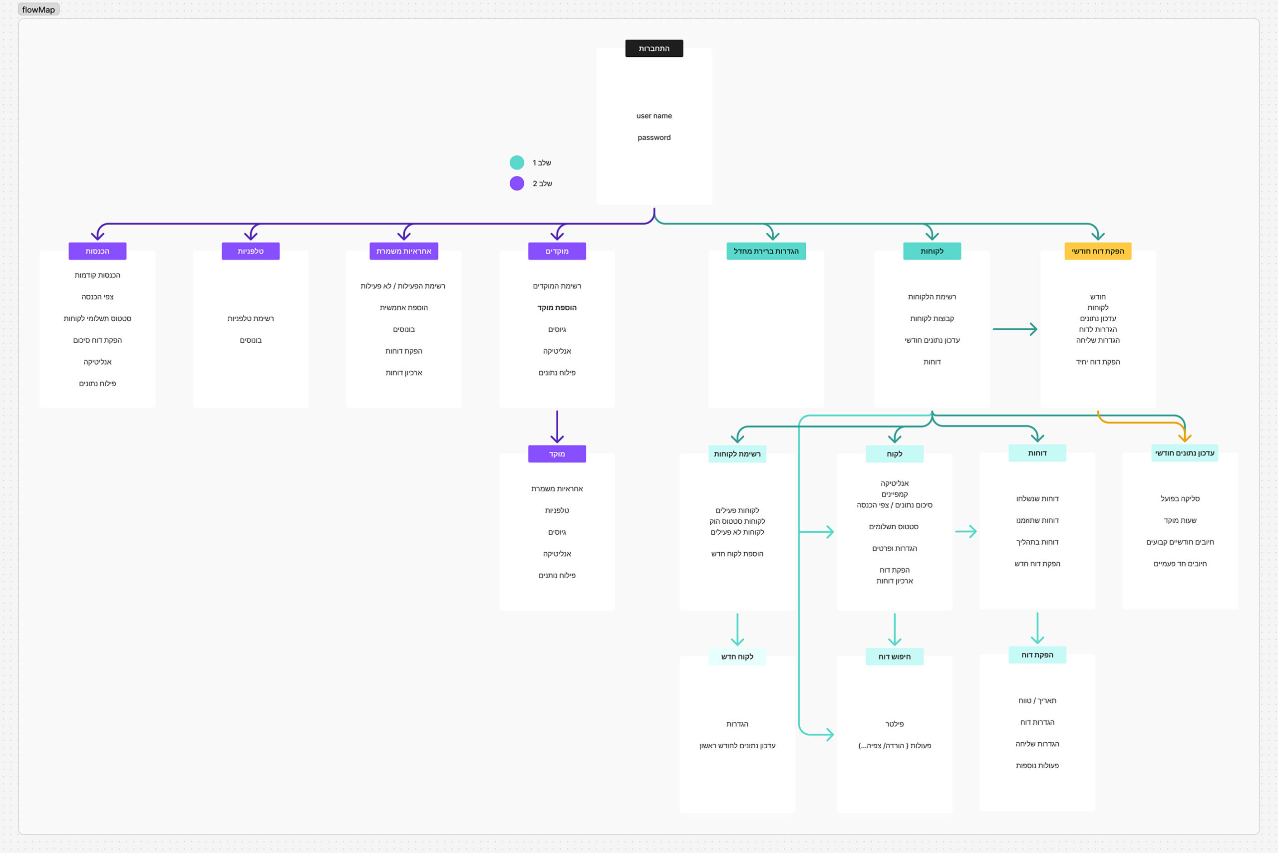
Flow map
The new system
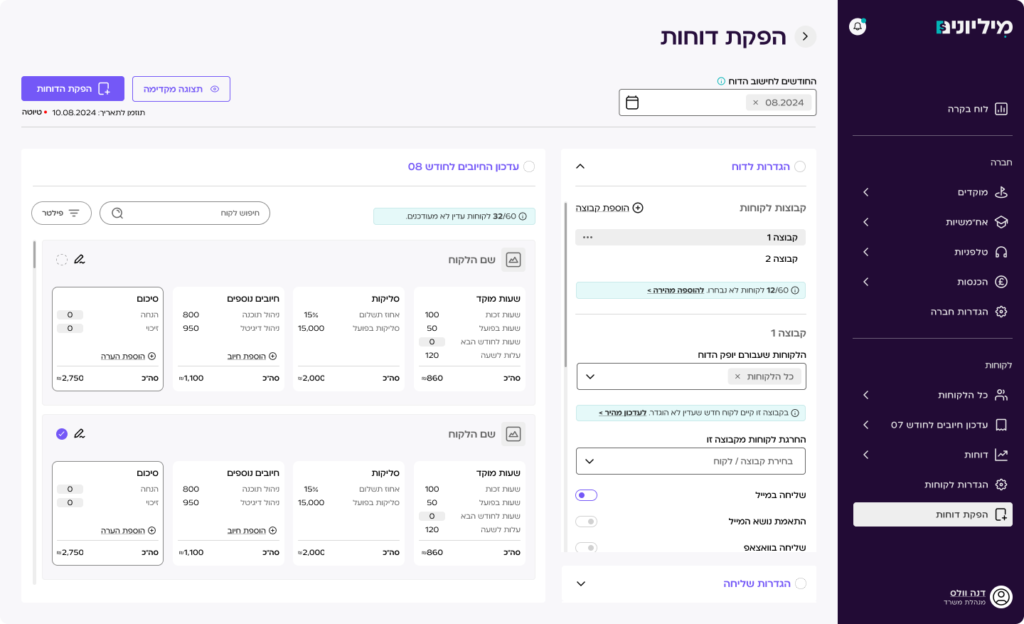
Since this is a complex and expansive system, I focused first on the most impactful area: report generation. Each component outlines the challenges in the old system, along with the solutions and benefits in the new version.
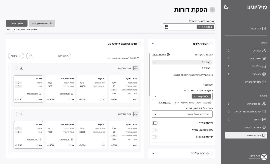
General Overview: Report Generation
Challenge:
The report generation process was spread across multiple disconnected screens, lacking clear hierarchy or chronology. Actions were scattered — some updates were made within the report generation screen, others elsewhere. The experience felt fragmented, overwhelming, and lacked any indication of process flow.
Solution & Benefits
- The new system provides a clear, streamlined experience focused on user flow.
- We mapped the process into 3 main steps:
- Report Settings – selecting months, clients, and report types.
- Monthly Charges Update – adjusting data for the relevant month.
- Sending Settings – schedule, format, and execution of report.
UX Consideration
- Each section is independent but visible and accessible on one screen.
- Clear chronological flow – start to finish.
- Only after completing all required fields can the report be generated.
- Report and sending settings appear first – allowing quick generation or replication.
- Data update appears only when needed, accessible but not intrusive.
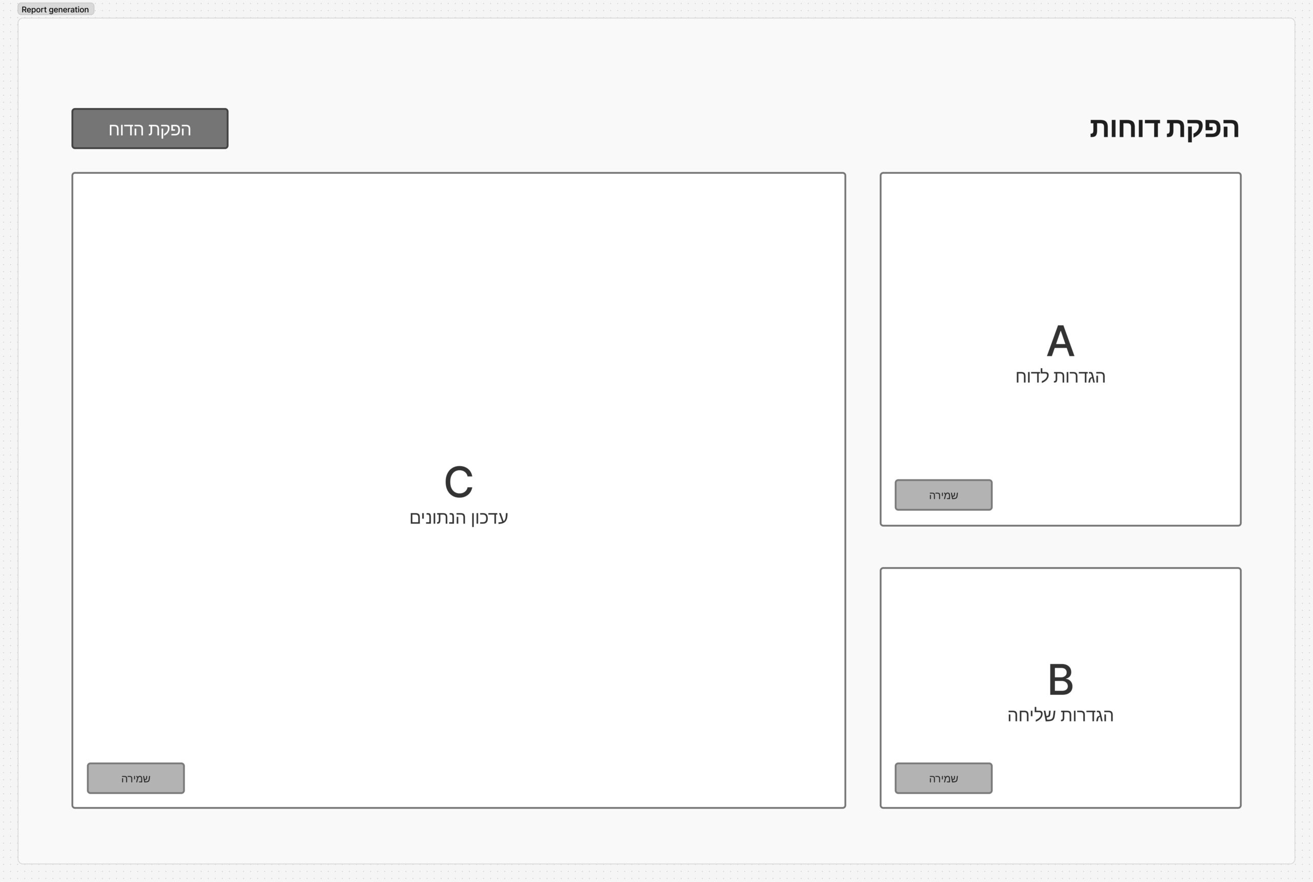
The 3 main steps
Detailed review
Report Settings
Challenge
In the previous system, month selection was unintuitive and inflexible. The current month was not the default; there was no way to select continuous or non-continuous ranges, and no summary option for multiple months or a whole year. Month selection was separate from other settings and required manual data updates with no undo option.
New System Solution
- The current month is the default and shown as a cancelable component.
- Users can add months or ranges using an interactive calendar, supporting both sequential and scattered selection.
- Actions (add/remove) are done via clear buttons, only enabled after selection.
- Users can choose between monthly breakdowns or a full summary.
- Client selection has a dedicated section with advanced filters. The default includes all clients, with the ability to exclude inactive or new ones.
- Visual tracking of selected clients is shown, with note options for exceptions.
Benefits
- Intuitive time range selection.
- Flexibility and control over report scope.
- Advanced filtering and precise client management.
- Fewer errors, faster setup.
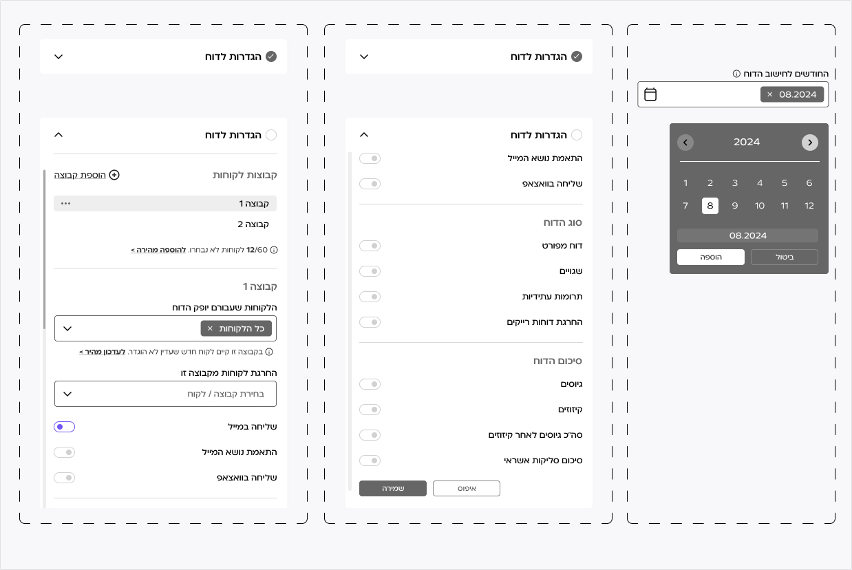
Components
Sending Settings
Challenge
The previous system didn’t support flexible scheduling. Reports could only be sent immediately after updating, creating deadline pressure and poor fit for dynamic needs.
New System Solution
- Added scheduling options:
- Immediate sending (enabled only after updates complete).
- Later same-day or next-day scheduling.
- Set recurring day-of-month.
- Select exact date & time from a dynamic calendar.
- Clear display of scheduled send info.
Benefits
- Full control over send times.
- Reduced stress and better alignment with organizational timelines.
- Prevents missed or mistimed sends.
- Clear and user-friendly UI.
Final Touches
- New loading screen replaces the black screen – light animation with calming message.
- After generation: festive modal with options:
- Preview
- Download
- Return to Dashboard
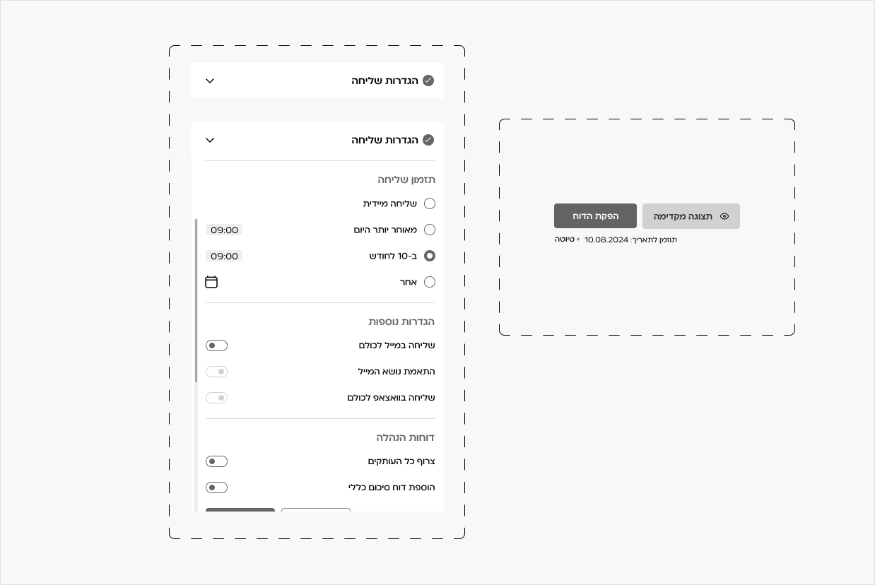
Components
Monthly Charges Update
Challenge
Previously, updates were made in an unsynchronized open list, separate from the report, with information overload and no filters — leading to errors and duplicates. It was not possible to update individual clients, and no clear approval mechanism existed.
New System Solution
- Updates are centralized in 3 synced locations: a dedicated main update section, quick access from report creation, and inline edits within client details.
- Editing is only enabled in edit mode, with visual cues for changed fields.
- Client logos are used for visual identification to reduce errors.
- The system tracks update status and provides advanced filtering and search.
- Report generation is enabled only after updates are complete.
- For past months, editing is locked — view-only mode is shown.
Benefits
- Significantly reduced human error.
- Transparent data tracking.
- Focused, controlled editing.
- Centralized and clear UX.
- Meets specific client needs.
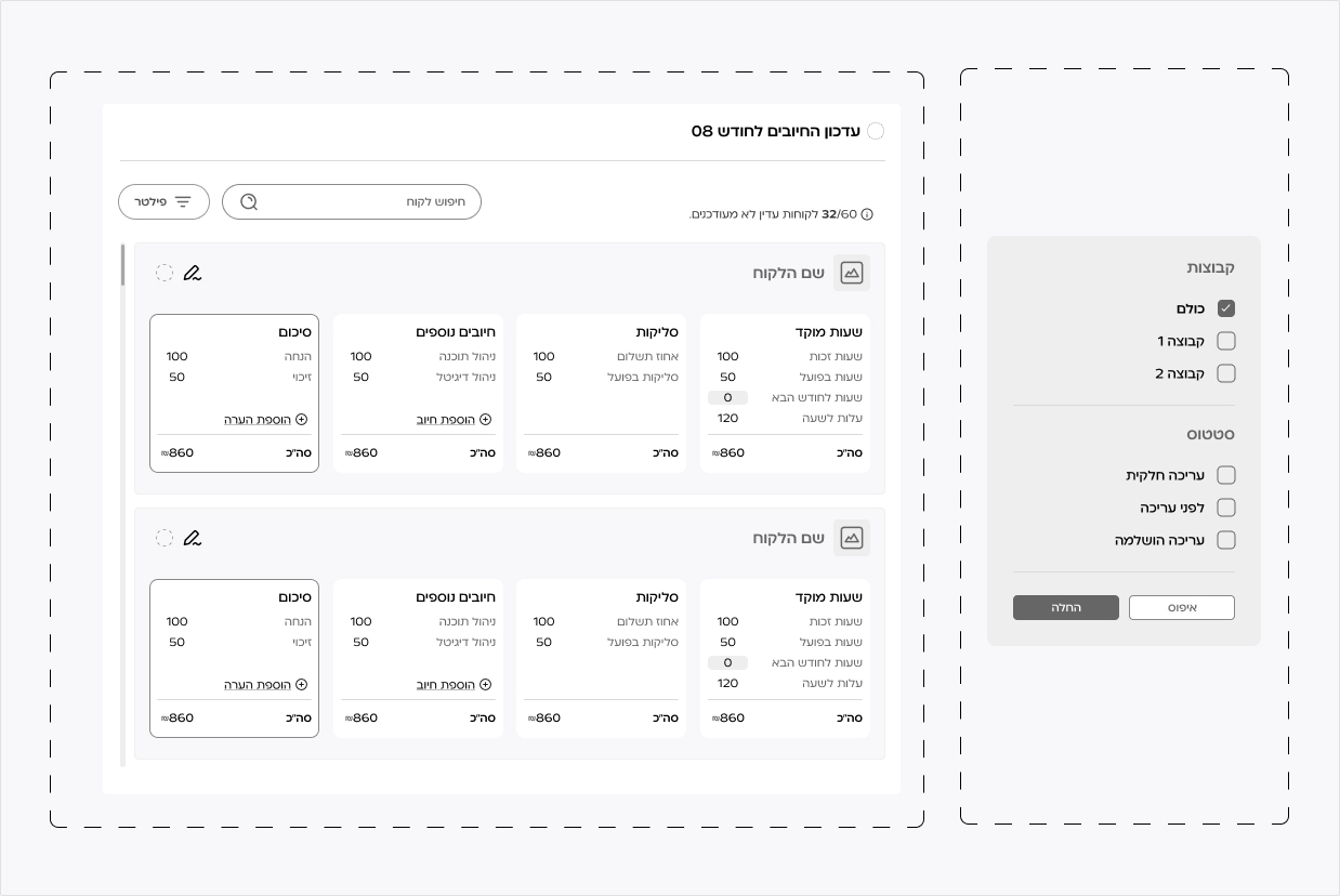
Components
Summary
Instead of a system where it was unclear where to begin, we designed a simple, precise journey based on deep research — one that Dana (and every other user) can understand, operate, and most importantly — trust.
Final screen